> ## Documentation Index
> Fetch the complete documentation index at: https://help.i88.io/llms.txt
> Use this file to discover all available pages before exploring further.
# Market Heatmap: See Every Asset in One View
> Read the whole market as a single treemap — tile size shows scale, colour shows the move, and one click switches between crypto, stocks, and forex.
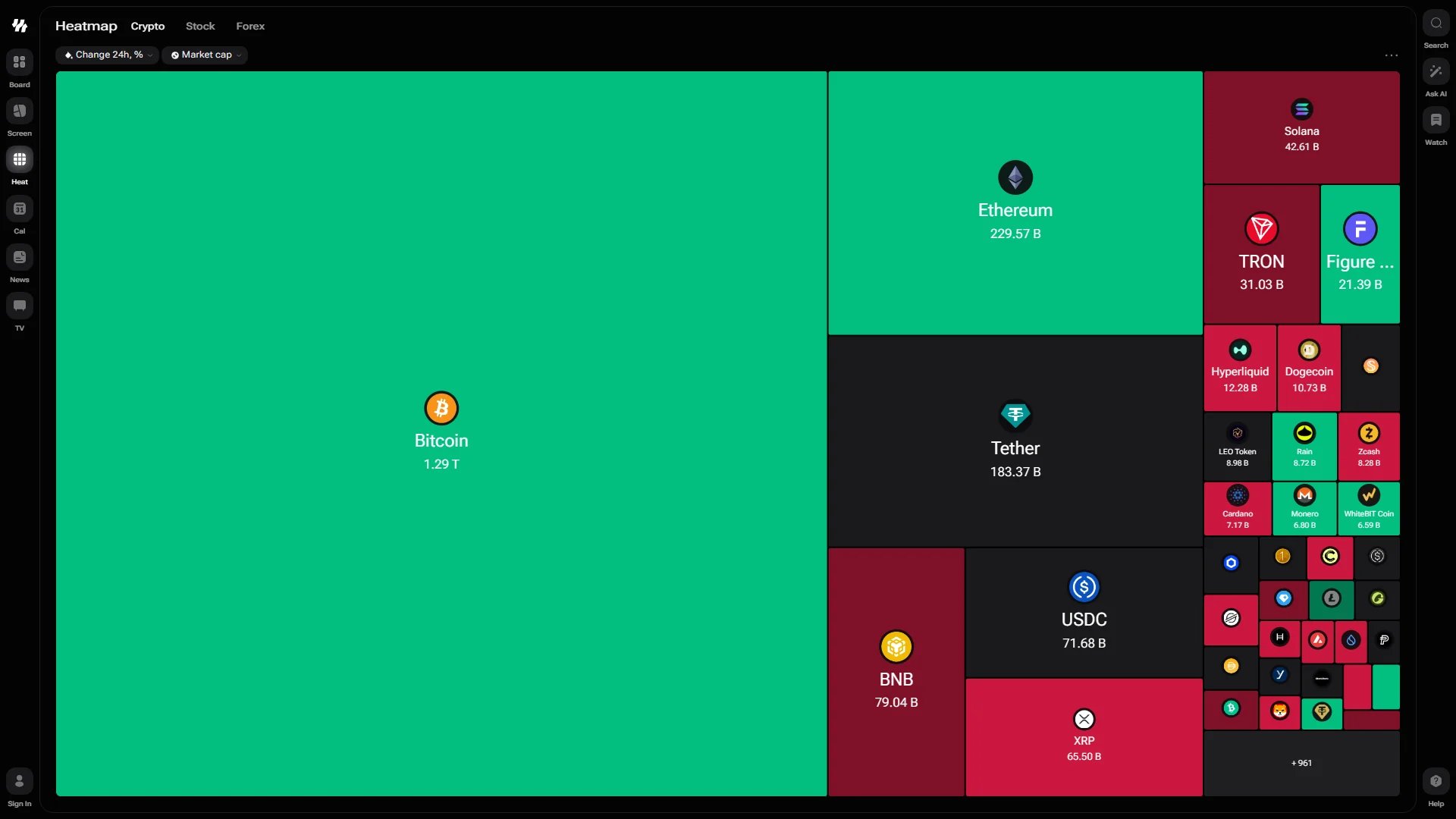
The heatmap answers one question fast: what is moving right now, and does it matter? Every instrument becomes a tile — the bigger the tile, the larger the asset; the greener or redder it is, the further it has moved. Open it from **Heat** in the left navigation rail, or go straight to the market you follow: [i88.io/heatmap/crypto](https://i88.io/heatmap/crypto), [i88.io/heatmap/stock](https://i88.io/heatmap/stock) or [i88.io/heatmap/forex](https://i88.io/heatmap/forex).
 ## Markets
Each market has a page of its own, and the three tabs beside the page title move between them in one tap:
| Tab | Address | What it covers |
| ---------- | ----------------- | -------------------------------------------------- |
| **Crypto** | `/heatmap/crypto` | Cryptocurrencies, one tile per coin. |
| **Stock** | `/heatmap/stock` | Equities, with an extra control for grouping them. |
| **Forex** | `/heatmap/forex` | Currency pairs, with a period selector. |
Because each market has its own address, a link you share opens exactly the map you were looking at — and shows that market in its preview. Your display choices, such as logos and tile titles, follow you across the tabs. An older `/heatmap` link still works and lands on the crypto map.
## Reading the Map
Selectors above the map control what the tiles mean:
* **Colour** — the change over the selected period. Green is a gain, red is a loss, and the deeper the shade the larger the move. The default is **Change 24h, %**.
* **Size** — the metric that decides how much room each tile gets. The default is **Market cap**, so the largest assets dominate the view.
Each tile carries the asset logo, its name, and the value of the sizing metric. Tiles too small to label keep just the logo, and a counter in the corner — `+961`, for example — tells you how many assets did not fit.
## Grouping Stocks
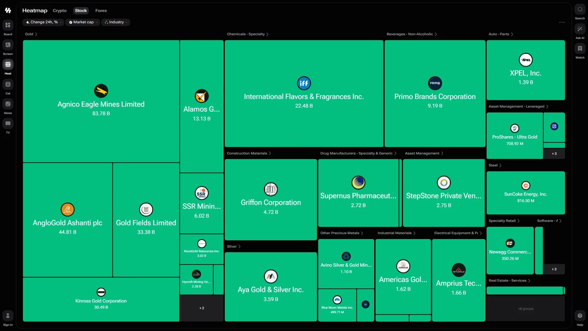
On the **Stock** tab a third selector appears: **Industry**. With it applied, tiles are gathered into labelled blocks — Gold, Chemicals – Specialty, Drug Manufacturers, Steel, Specialty Retail — each with its own header above the group. A `+8 groups` counter at the edge shows how many blocks are folded out of view.
This is what turns the map from a list of movers into a read on rotation: when one industry block is uniformly green and its neighbour is red, capital is moving between them.
## Markets
Each market has a page of its own, and the three tabs beside the page title move between them in one tap:
| Tab | Address | What it covers |
| ---------- | ----------------- | -------------------------------------------------- |
| **Crypto** | `/heatmap/crypto` | Cryptocurrencies, one tile per coin. |
| **Stock** | `/heatmap/stock` | Equities, with an extra control for grouping them. |
| **Forex** | `/heatmap/forex` | Currency pairs, with a period selector. |
Because each market has its own address, a link you share opens exactly the map you were looking at — and shows that market in its preview. Your display choices, such as logos and tile titles, follow you across the tabs. An older `/heatmap` link still works and lands on the crypto map.
## Reading the Map
Selectors above the map control what the tiles mean:
* **Colour** — the change over the selected period. Green is a gain, red is a loss, and the deeper the shade the larger the move. The default is **Change 24h, %**.
* **Size** — the metric that decides how much room each tile gets. The default is **Market cap**, so the largest assets dominate the view.
Each tile carries the asset logo, its name, and the value of the sizing metric. Tiles too small to label keep just the logo, and a counter in the corner — `+961`, for example — tells you how many assets did not fit.
## Grouping Stocks
On the **Stock** tab a third selector appears: **Industry**. With it applied, tiles are gathered into labelled blocks — Gold, Chemicals – Specialty, Drug Manufacturers, Steel, Specialty Retail — each with its own header above the group. A `+8 groups` counter at the edge shows how many blocks are folded out of view.
This is what turns the map from a list of movers into a read on rotation: when one industry block is uniformly green and its neighbour is red, capital is moving between them.
 ## Choosing a Period on Forex
The forex map carries a period selector along the bottom: **1D**, **1W**, **1M**, **3M**, **6M**, **1Y** and **5Y**. Pick one and the colours re-read the same pairs over that horizon — a pair that looks flat on the day can be firmly red across the quarter.
On a narrow screen, or when the map is squeezed down as a dashboard widget, the row of periods folds into a badge in the toolbar above the map so the tiles keep the room they need.
## Navigating a Crowded Map
* **Pan** — click and hold, then drag to move across the map. This stays smooth even with hundreds of assets on screen.
* **Resize** — the map re-flows as the window changes size, keeping tiles balanced rather than stretching them.
The heatmap is a scanning tool. Use it to spot the outlier, then open that instrument in the search bar to study it on its [ticker page](/market-tools/ticker-pages).
## Heatmap Widget
The same map is available as a dashboard widget, so you can keep a compact version beside your other panels. Add it from **Set Up → Add** on any dashboard tab — see [Adding & configuring widgets](/dashboard/widgets).
## Choosing a Period on Forex
The forex map carries a period selector along the bottom: **1D**, **1W**, **1M**, **3M**, **6M**, **1Y** and **5Y**. Pick one and the colours re-read the same pairs over that horizon — a pair that looks flat on the day can be firmly red across the quarter.
On a narrow screen, or when the map is squeezed down as a dashboard widget, the row of periods folds into a badge in the toolbar above the map so the tiles keep the room they need.
## Navigating a Crowded Map
* **Pan** — click and hold, then drag to move across the map. This stays smooth even with hundreds of assets on screen.
* **Resize** — the map re-flows as the window changes size, keeping tiles balanced rather than stretching them.
The heatmap is a scanning tool. Use it to spot the outlier, then open that instrument in the search bar to study it on its [ticker page](/market-tools/ticker-pages).
## Heatmap Widget
The same map is available as a dashboard widget, so you can keep a compact version beside your other panels. Add it from **Set Up → Add** on any dashboard tab — see [Adding & configuring widgets](/dashboard/widgets).