

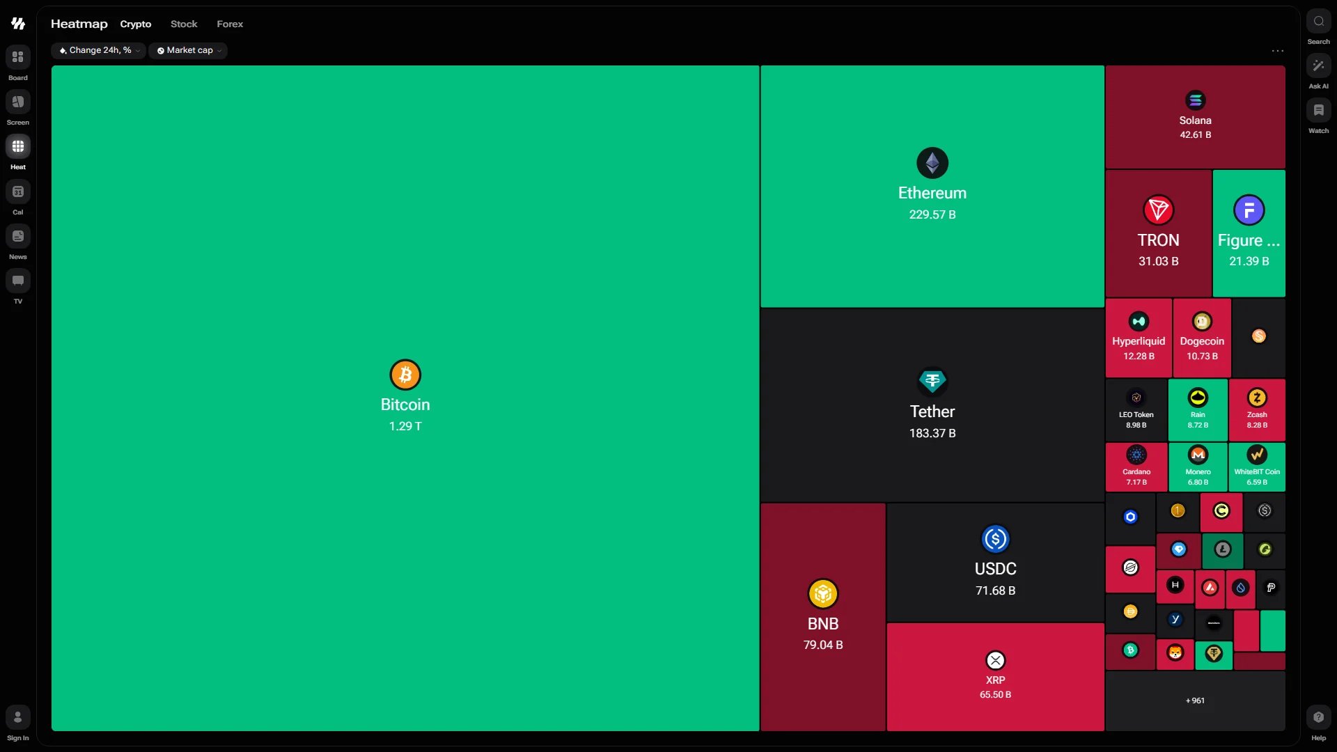
The crypto heatmap, sized by market cap and coloured by 24-hour change
Markets
Each market has a page of its own, and the three tabs beside the page title move between them in one tap:
Because each market has its own address, a link you share opens exactly the map you were looking at — and shows that market in its preview. Your display choices, such as logos and tile titles, follow you across the tabs. An older
/heatmap link still works and lands on the crypto map.
Reading the Map
Selectors above the map control what the tiles mean:- Colour — the change over the selected period. Green is a gain, red is a loss, and the deeper the shade the larger the move. The default is Change 24h, %.
- Size — the metric that decides how much room each tile gets. The default is Market cap, so the largest assets dominate the view.
+961, for example — tells you how many assets did not fit.
Grouping Stocks
On the Stock tab a third selector appears: Industry. With it applied, tiles are gathered into labelled blocks — Gold, Chemicals – Specialty, Drug Manufacturers, Steel, Specialty Retail — each with its own header above the group. A+8 groups counter at the edge shows how many blocks are folded out of view.
This is what turns the map from a list of movers into a read on rotation: when one industry block is uniformly green and its neighbour is red, capital is moving between them.
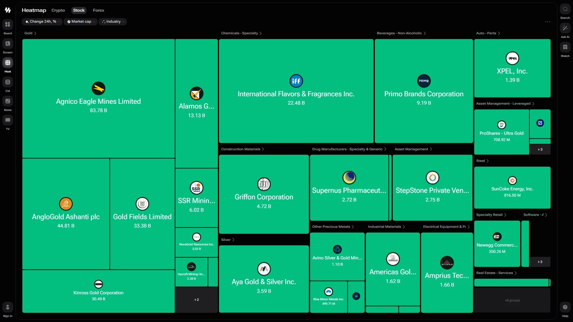
The stock heatmap grouped by industry
Choosing a Period on Forex
The forex map carries a period selector along the bottom: 1D, 1W, 1M, 3M, 6M, 1Y and 5Y. Pick one and the colours re-read the same pairs over that horizon — a pair that looks flat on the day can be firmly red across the quarter. On a narrow screen, or when the map is squeezed down as a dashboard widget, the row of periods folds into a badge in the toolbar above the map so the tiles keep the room they need.Navigating a Crowded Map
- Pan — click and hold, then drag to move across the map. This stays smooth even with hundreds of assets on screen.
- Resize — the map re-flows as the window changes size, keeping tiles balanced rather than stretching them.